Intermountain Health
Looking at health in a whole new way
Intermountain Health is the largest nonprofit health system in the Intermountain West. They are dedicated to creating healthier communities and helping patients live their healthiest lives possible.
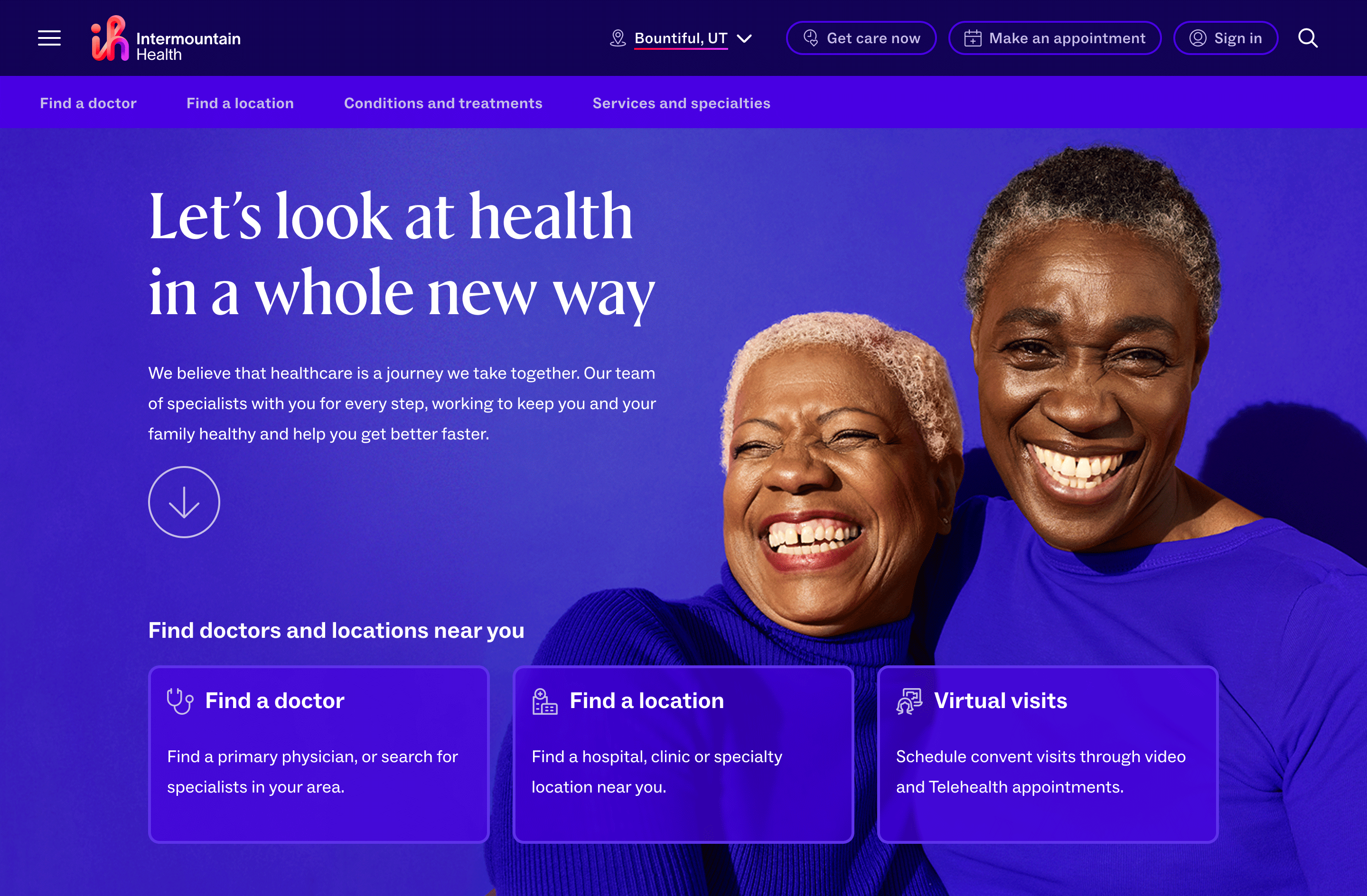
Intermountain Healthcare was in the process of updating their brand identity to Intermountain Health with a fresh new logo and mission oriented towards the patient.
The original scope of the project included a ground-up redefinition of their website with upgrading their CMS platform from SiteCore 8 and 9 to SiteCore 10. As our agency was shifting away from a 6 month discovery phase to defining the project, Intermountain Healthcare was merging with three other major healthcare systems in the Intermountain West that needed to be included into the new scope of their digital transformation.
This merger included Intermountain Healthcare, Intermountain Healthcare Nevada, Saltzer Health, and SCL Health.
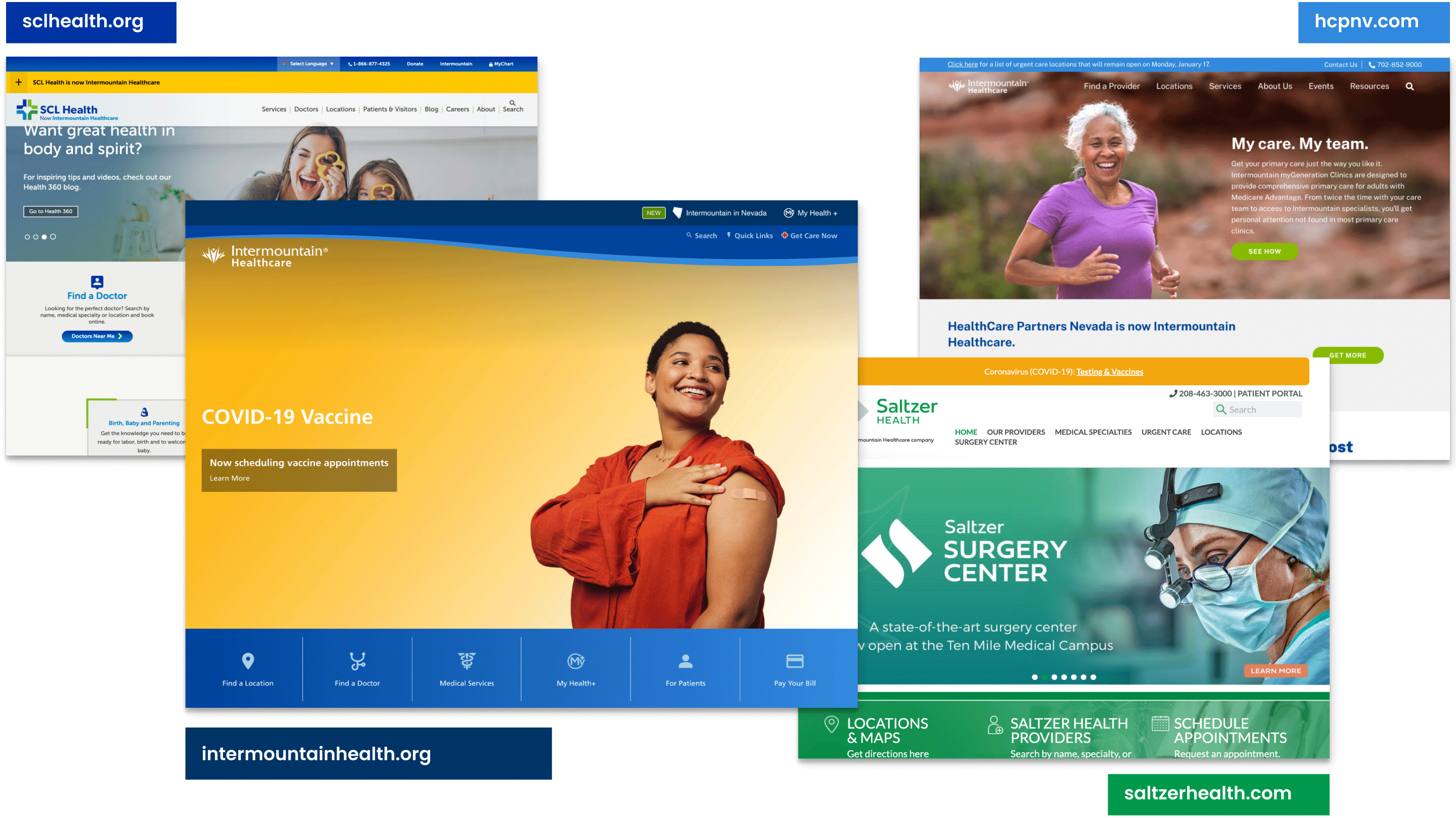
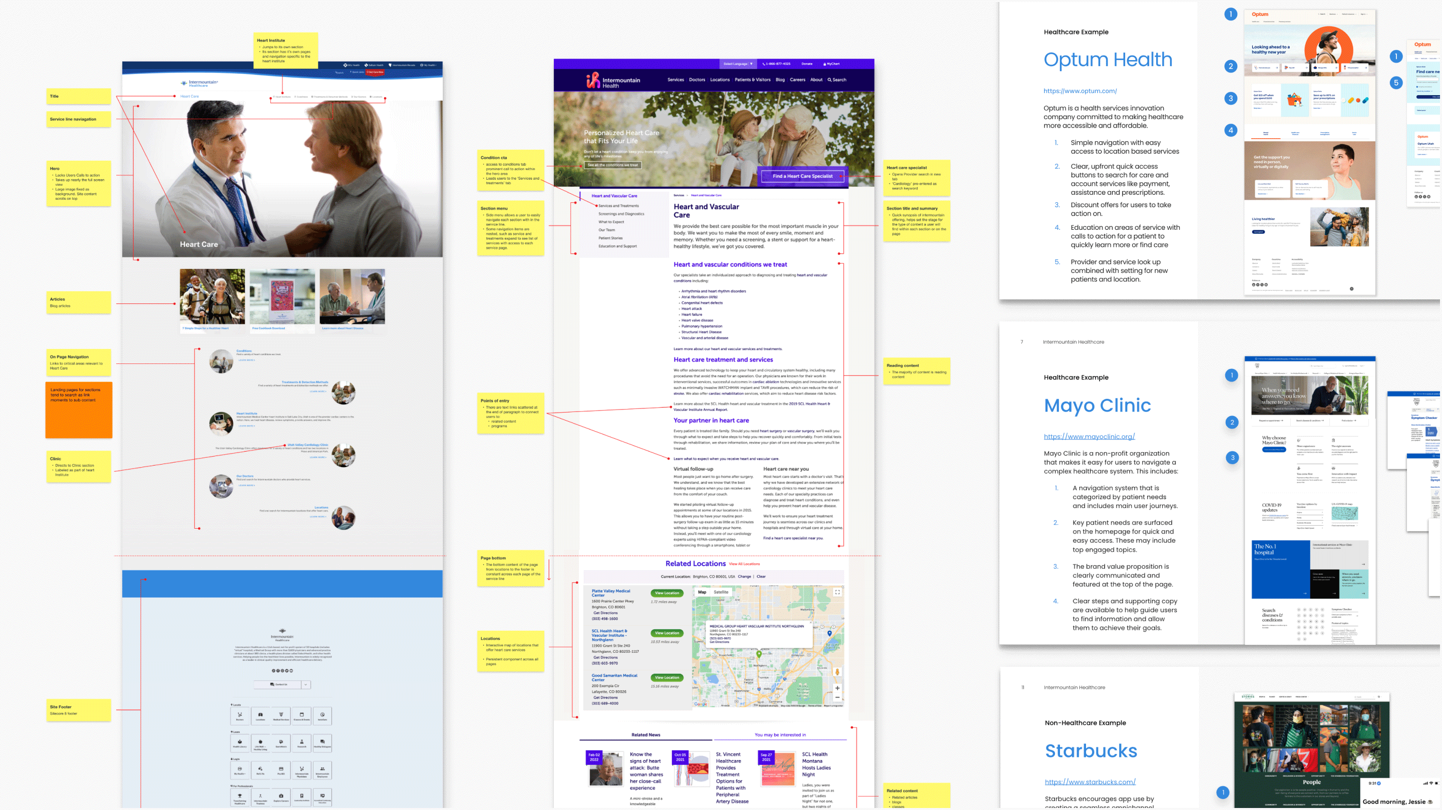
With four healthcare systems merging, and a new brand identity in the works, we analyzed each hospital site closely which included 4 major domains across multiple CMS platforms. We also conducted a competitive analysis of healthcare competitors and non-medical best-in-class examples to provide inspiration for the new direction of the website that would shift focus towards the consumer.
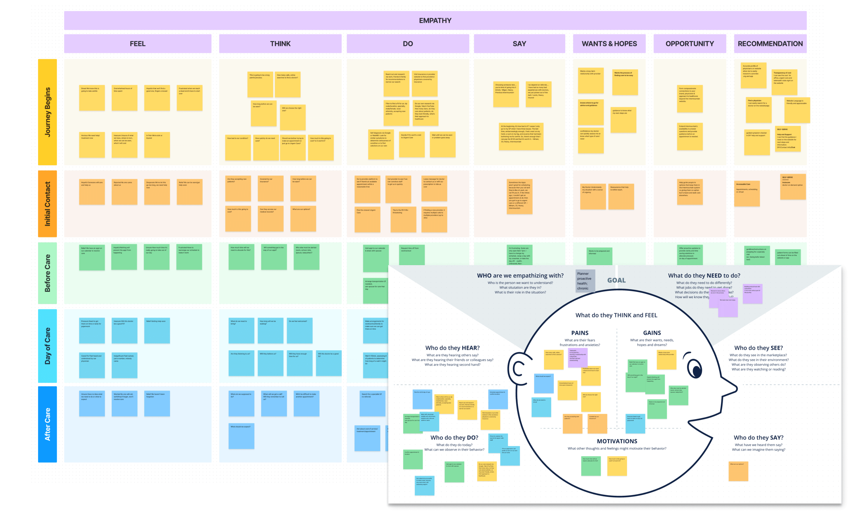
At the start of this project we utilized existing user research to generate our initial personas and typical user journeys. We collaboratively worked with the client to ensure we were capturing their demographic accurately. Throughout the design process we utilized every moment we had with users during user testing to validate and continue to groom our personas and their journeys.
In the region Intermountain Health serves, mothers caring for their families as well as caretakers caring for an aging population became the key audience we wanted to prioritize as well as balancing the needs patients with chronic conditions have.
Our Personas
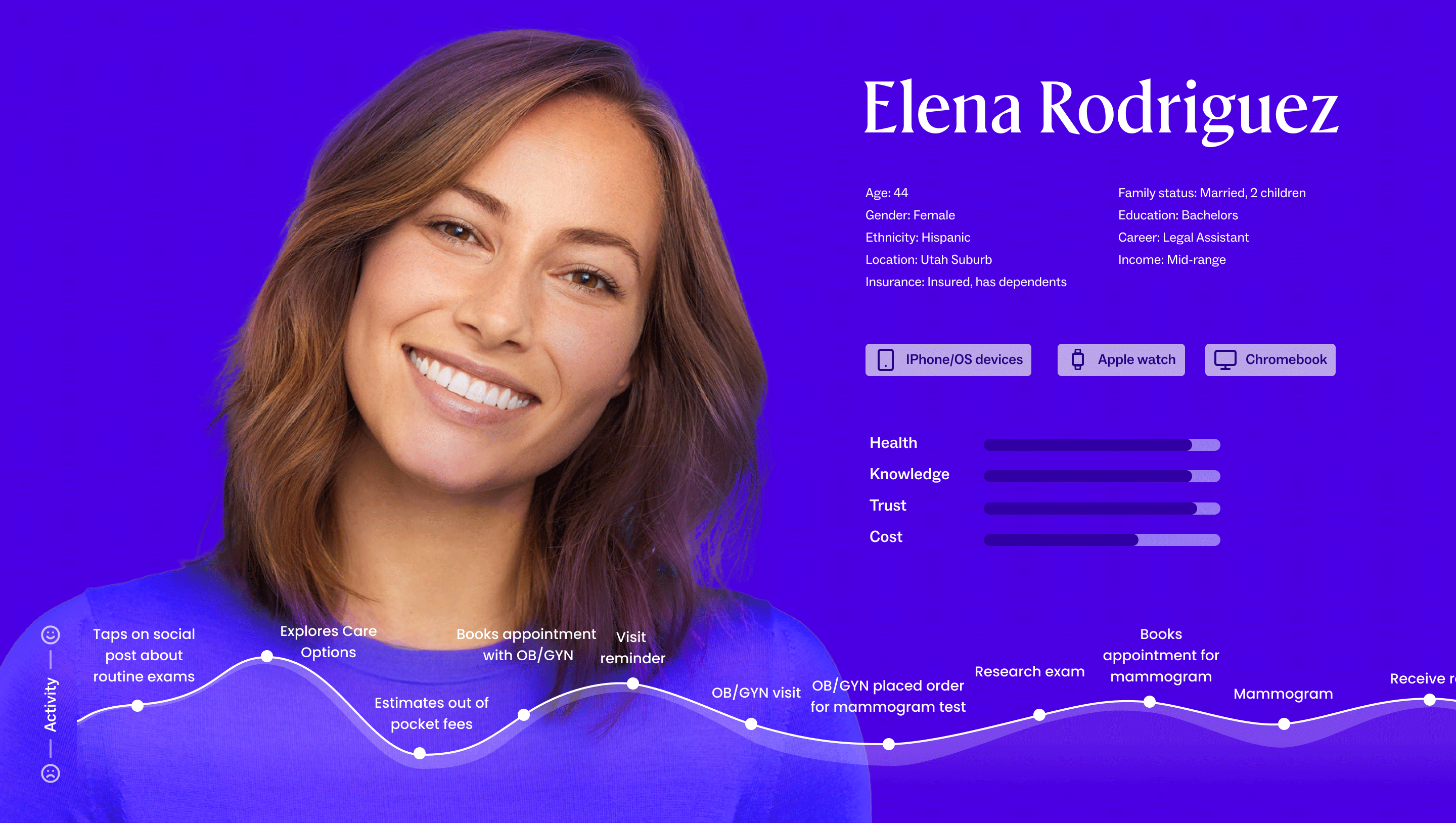
With our continued research in mind, we groomed a family of personas. The mother, Elena, caring for her young son as well as the being the primary caregiver for her aging father. We also included her husband Josh, who has a chronic condition and needs continuous care and follow ups with his specialist.
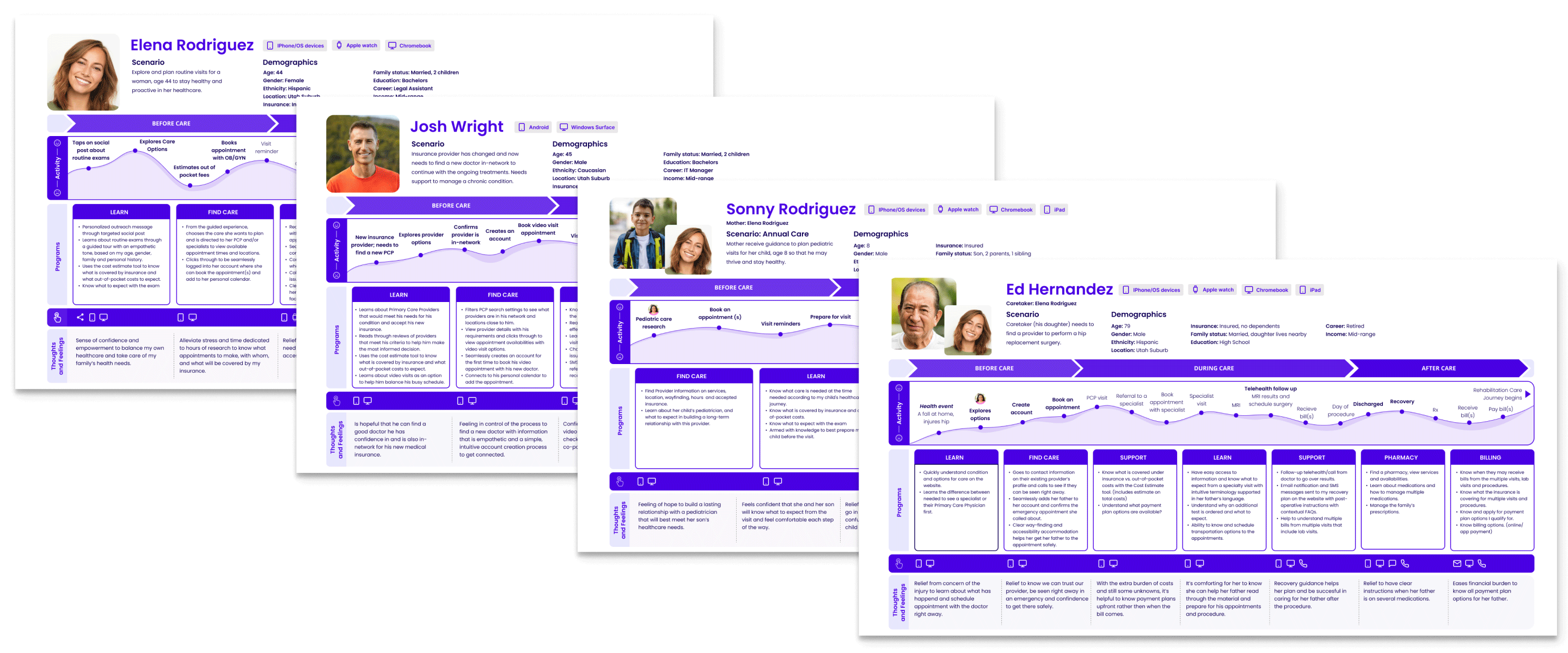
As we began to conduct user studies, we took the opportunity to continue to get to know our users better during research actives with 1 on 1 interviews to talk to and learn more about our patients.
Card Sorting
Understand how users would group items together.
In the card sorting activity we asked users to group common terms found across the hospital website. We found that users wanted to find information organized by what matters to them such as their primary providers, and a ‘dashboard’ that would contain all the information that is relative to them.
Tree Testing
Can users find items that are grouped together?
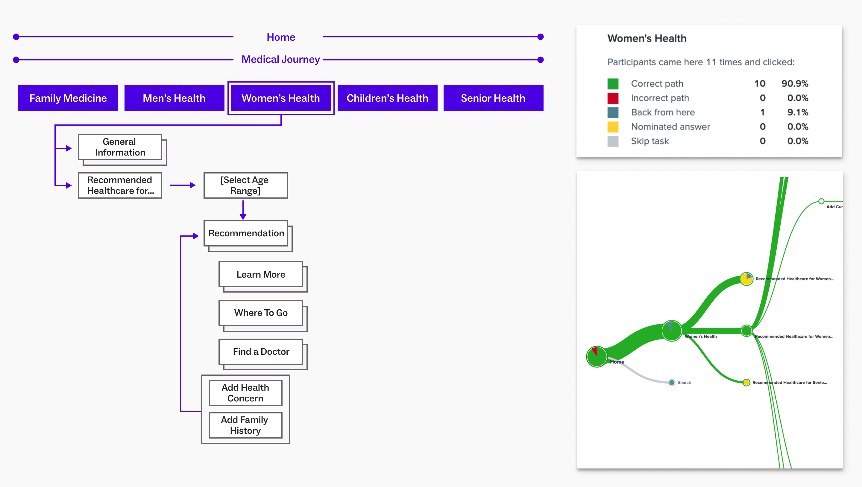
In tree testing we tested A and B versions of a potential site structures against each other, looking to see how users were able to find content in a task oriented hierarchical structure verses a journey based matrix and linear structure.
In both test we tested the same three task scenarios and observed that the matrix and linear structure allowed users to move through the content with flexibility. The hypotheses we generated from these findings was that dynamically placed content and actions on page would create personal and meaningful moments as well as provide contextual entry points for patents to learn, find and explore key flows within the experience.
Low-Fidelity Usability Testing
Is it usable?
In low-fidelity testing we looked to see if users could complete a task within a clickable structure.
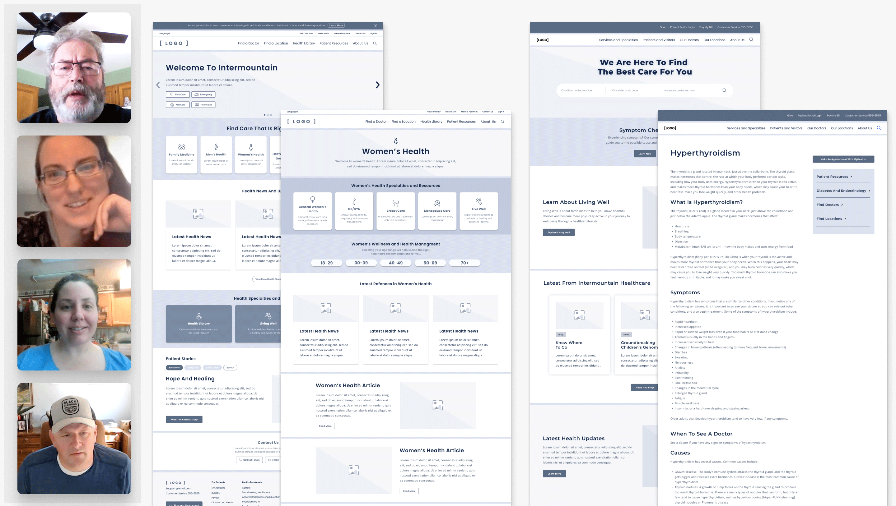
We tested with 7 patients of Intermountain Health via 1 hour long qualitative interviews over zoom. Each tester was shown A and B versions of the test and asked to complete a series of tasks such as finding and scheduling care, finding information on a chronic condition and how would they find urgent care options.
In test A: The Proactive Wellness Journey, the hypothesis was a personalized approach to proactive wellness care, allowing users to choose their health journey and build a recommendation right for them based on stage of life, current health conditions and family history.
In Test B: The Self Serve experience, our hypothesis was that a search–led experience would prioritize the learn journey, empowering patients to find what they need quickly and explore on their own.
Our findings led us to believe that users typically start their searches with Google, and that there was a strong preference to see health guidance recommendations by age group and demographics. Users preferred the inclusivity of groupings such as for Seniors, and wanted a persistent and accessible path to make an appointment.
Mid-Fidelity Usability Testing
With the findings from the Low-fidelity test, we slightly increased fidelity and incorporated our findings to form two new hypotheses: ’One Screen’ vs ‘Above the Fold’.
Both approaches were mobile-first to help us ensure we are including only the right content in a format that meets users where they are more likely to engage with the website. With a ‘one screen’ approach, users can engage and tap on clear calls-to-action verses placing critical content and tasks ‘above the fold’ to enable users to take action quickly, while still creating browsable moments.
Again we tested with 5 patients of Intermountain Health via 1 hour long qualitative interviews over zoom.
From this test we found that users preferred the directness of the ‘one screen’ approach with quick and direct access to tasks and content. They liked curated content such as recommendations, classes, and news based on their own health background. Users also again commented on the preference for inclusivity of grouping content into categories, especially for LGBTQ+.
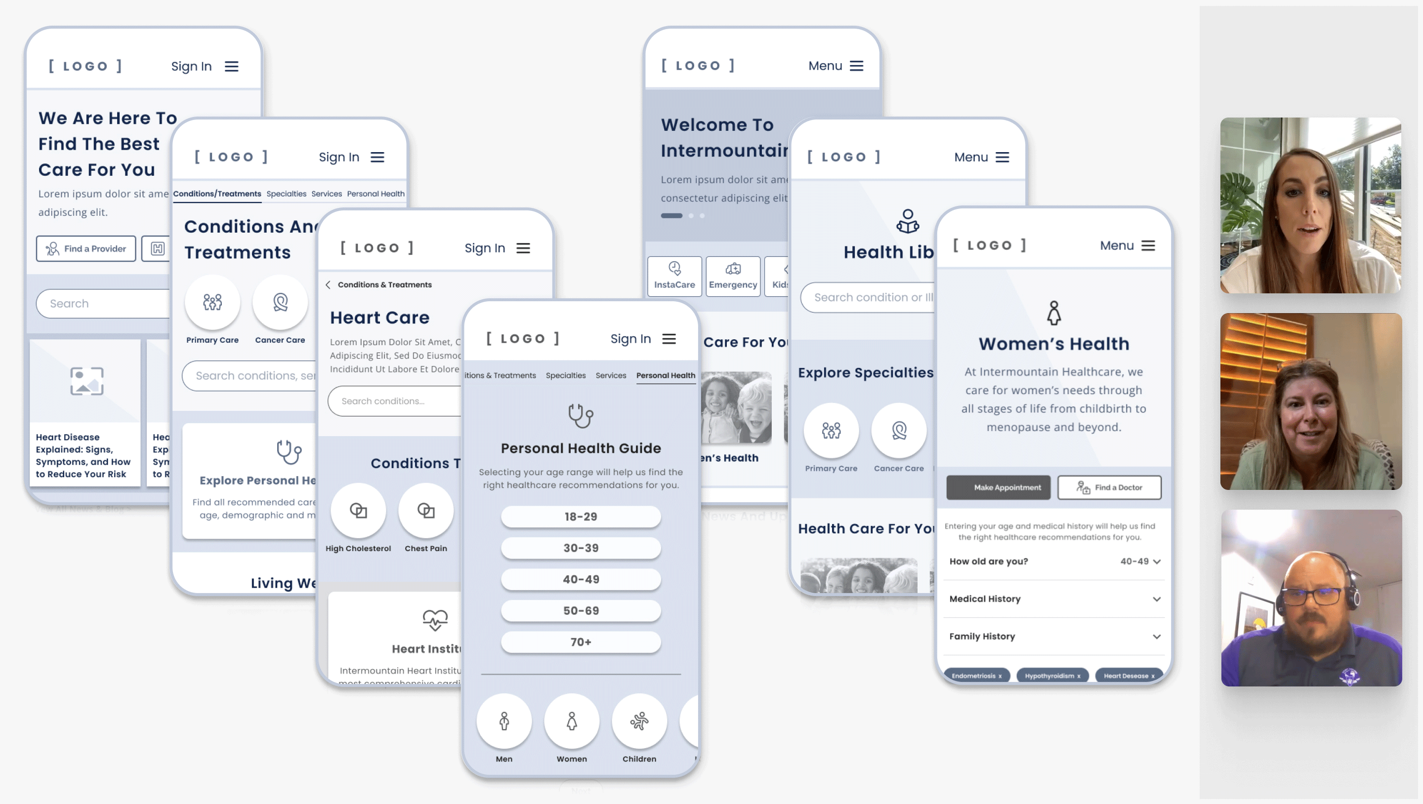
“I like the inclusivity, especially with the seniors. Everyone’s included. It’s very nice “
Within the the creative and UI cycles of the project we closely aligned with the branding team at FutureBrand as the new branding for Intermountain Health was in the last stages of finalization. We had a logo, color pallet and initial photography references that was to represent the new brand.
In the first round of creative testing we tested 4 different hypotheses:
- Guiding Journey
Healthcare tailored for you, every person’s health journey is unique. - Trusted Partnership
Be the provider of choice through trust and building positive relationships. - Expanding Heritage
A leader in innovation and high-quality care – building on a foundation of a proud history of bringing high-quality care to patients and communities. - Urgency
It’s time to look at health in a whole new way – working with the patient to make healthcare accessible and affordable to keep them healthy.
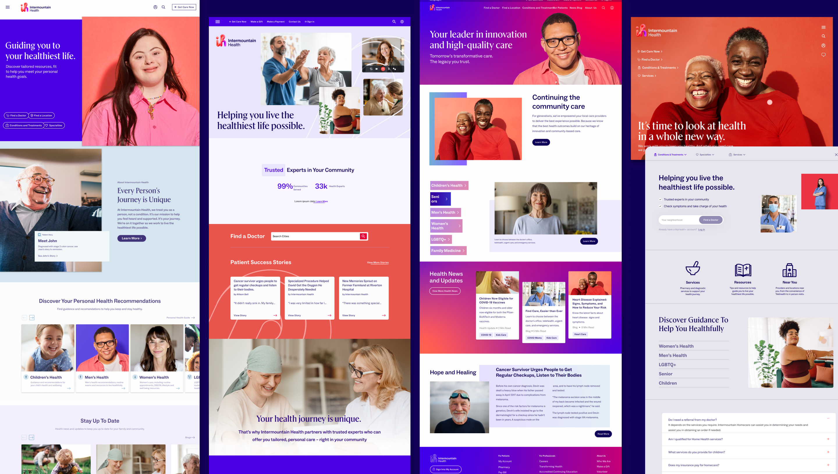
We tested these 4 routes with 6 patients of Intermountain Health in 1 hour long zoom interviews. All 4 directions were briefly shown in random order to each participant for a first impression. Then, each participant as able to go back and explored each direction on their own to provide more in-depth impressions and feedback.
Findings from this test pointed to the two routes that narrowed our creative solutions down to: ‘Expanding Heritage’ and ‘Urgency’. Users liked the vibrancy of ‘Expanding Heritage’ as well as the essence of story telling this version provided. For the ‘Urgency’ approach, user liked the “get in and get out” simple layout as well as the welcoming friendliness of the two ladies in the background image.
Creative Impression Study – Round 2
From here, we took our findings, iterated and went into a second round of testing. For this second test, we conducted a survey impression test with 44 respondents. Surveyors were briefly shown in random order the 2 new routes against 2 direct competitors of Intermountain Health.
At the same time we also conducted unmoderated UserZoom tests with 6 patients of Intermountain Health where we were able to give prompts to users within each of the 3 new routes to observe their overall impression of the creative and layout while also testing the usability.
After synthesizing the findings of the survey together with the unmoderated user test, our recommendation to move forward in finalizing the creative approach for the new brand’s website was that the overall look and feel needed to maintain a calm and warming feel with imagery that is motivating to users.
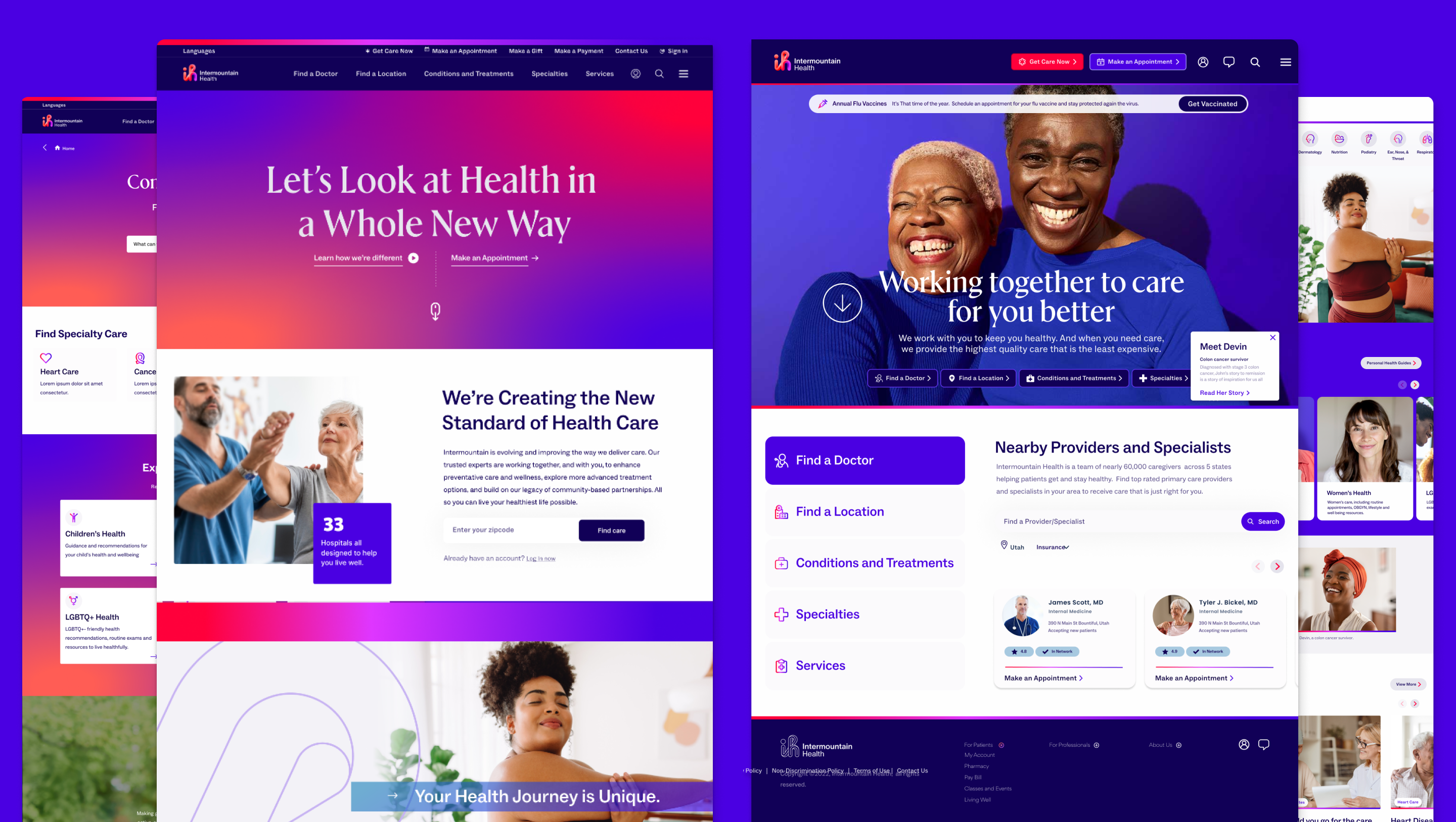
Ultimately there were over 30,000 pages to consider across the website long term, we took the approach of focusing on on the most important areas that saw the most traffic for the first release of the new website and how we were introducing the new brand to the audience.
Design worked closely with content strategy and copy writers on critical sections including the About section, Primary Care, Women’s Health and Pregnancy and Baby. We also prioritized the blogs section, noting that most user traffic entered through articles, which provides an optimal opportunity to engage patients with further content or directed them to the right type of care.
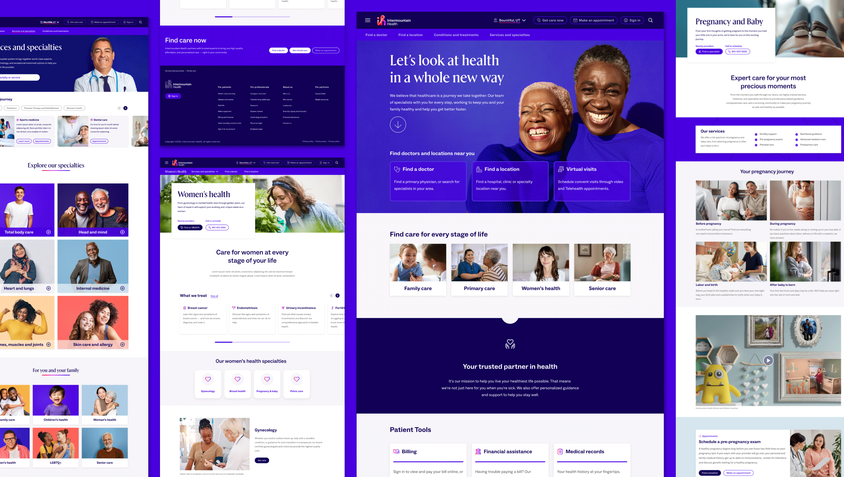
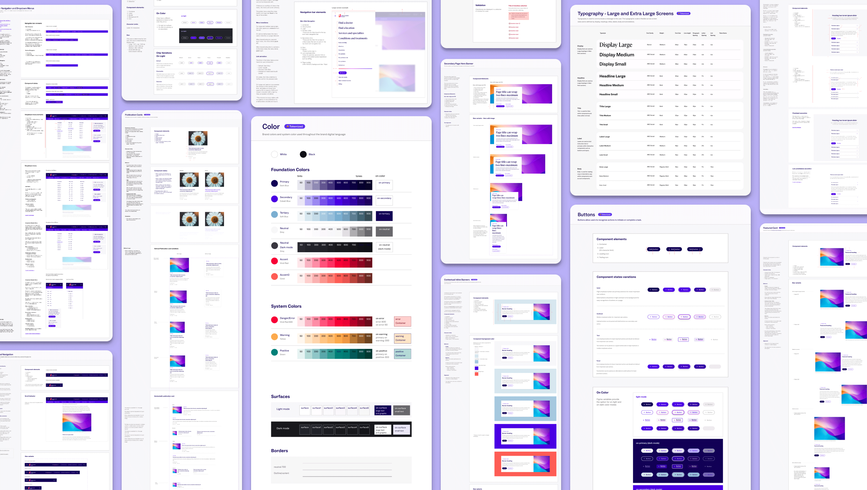
A large part of the delivery of this project was a new design system for Intermountain Health. With updated branding, new components and new templates we delivered a design system for designers in Figma. We followed a structure best suited for React Material UI and introduced a layered file structure of foundations, core components commonly used throughout the Intermountain Health digital ecosystem and SiteCore templates.
We delivered on a need for design tokens and pivoted from ‘Figma Tokens’ plugin to utilize design variables when Figma released the new variable feature. This allowed our teams and the Intermountain Health design team to design brand themes, use light and dark mode and provided consistency of standards by utilizing tokens with the development teams.
We also introduced the cadence of design governance with the Intermountain Health design team, creating a community of collaboration where we discussed, reviewed and improved on the design system, reflecting on needs of different areas of the business.
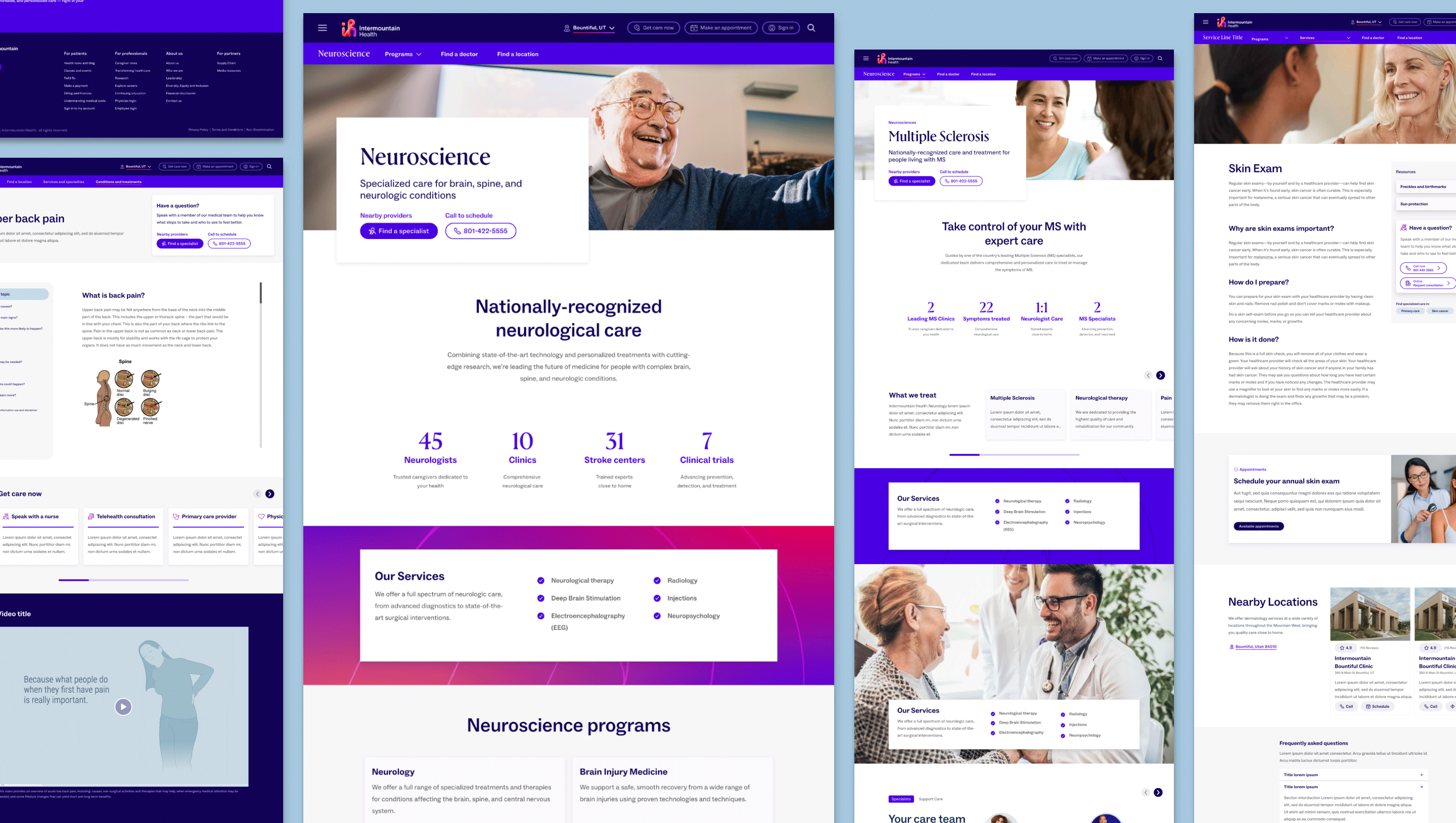
Post–release 1, the next critical area of the website we focused in on were the 44+ service lines such as Heart Care, Neuroscience, Orthopedics and Cancer Care.
Client workshop
We kicked off the work on service lines with a 2 day in–person client workshop where we reflected on the service lines across the legacy Intermountain Health and SCL Health websites. We discussed what is important to the business and to the stakeholders of the service lines. We thought about what is important to patients as well as how to get patients to the right care quickly.
We then brainstormed on new ideas for the services lines. We though of how to create templates that meets the needs of the complex service lines and their programs.
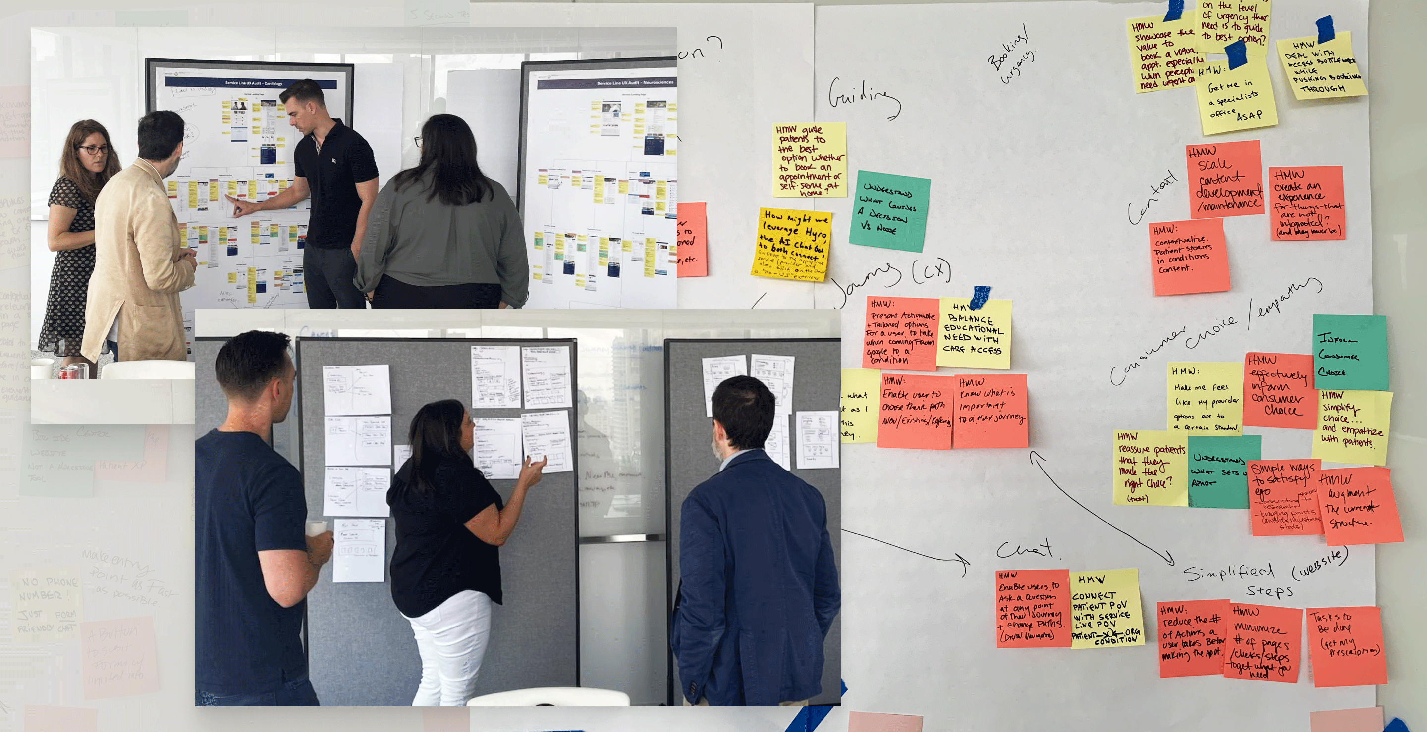
We then took these ideas, prototyped them and conducted unmoderated user testing with patents of Intermountain Health.
With parts of the existing website relevant and other parts too outdated to use as reference, the content team worked closely with the core client team to meet with SMEs of each service line to gather the right information that needed to be conveyed to users
Together we groomed to first release versions of the service line templates, and are looking forward to releasing an updated designation for each specialty and it’s services.
This project was challenging. It was large and met with many surprises along the way, such as the merger of the 4 healthcare systems and shifting timelines. But I loved the challenge and the complexity. It was a joy to work with Intermountain Health, their core team and design team and it was an exciting large scale project for our agency to dig in, and think creatively in this space.
Credits:
Client: Intermountain Health
Agency: Hugo & Cat
Project Manager: Selam M, Ailish Ryder
Client Services: Jack Garrigan
UX Strategy: Jessica Keith
Design Director, Design Lead: Julia Murphy
Designers: Akiko Hattori, Waila Skinner, Anna Goa, Hengzhi Huang
Content and Content Strategy: Mathew Hall, Jon Williams, Elizabeth Gordon
Tech Leads: Karishma Jootla, Micheal Holland, Dale Moir