The American College of Surgeons
Setting the Standard for Surgical Care
The American College of Surgeons is an educational and quality association dedicated to improving the care of the surgical patient and setting standards of care in an optimal and ethical practice environment.
Their ultimate mission is to advance surgical quality to improve patient outcomes.
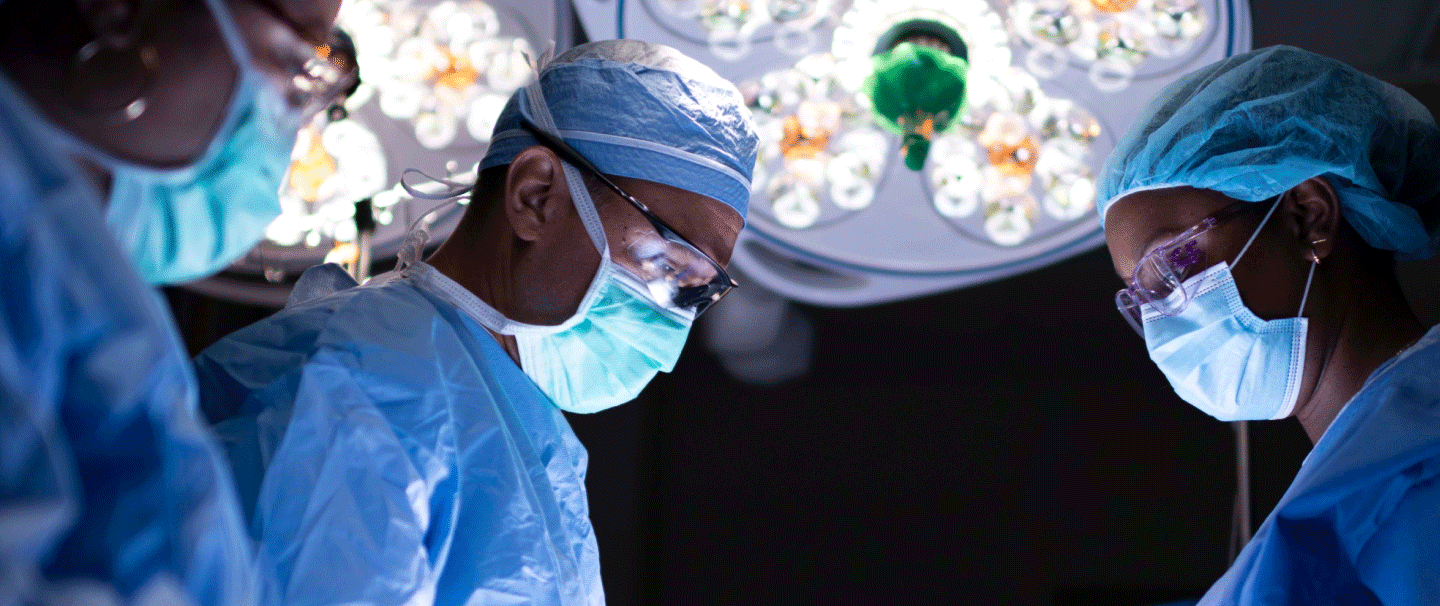
The stakeholder landscape of the ACS is pretty complex and broken out into multiple silos such as the Division of Education, Quality Programs, and Member Services.
As a result of the way the organization is structured, the website was similarly structured, and Not structured around the end user’s needs.
Our approach to reimagining the experience was to shift focus from the business silos to the user. We looked at the wants and needs from the point of view of the Surgeon, the Medical professional and the Patient.
We kicked off a 6 month long discovery phase where we spoke with users to help us identify and truly understand what is important to them. For this we took a qualitative approach and conducted over 40 in-depth surgeon interviews as well as surveying users of the website.
In the first phase of the project we were focused on 2 core audiences, the surgeons and the medical professionals.
For surgeons, we learned that they truly care about their patients and the perception that patients have of them.
We looked at the surgeon’s journey at various stages of one’s career to understand their goals and challenges such as the stress of being a surgeon, the importance of well-being, continuing education and support.
Considering the surgeon at different stages of their career helped us to prioritize their needs. For instance, Medical Students are looking for mentorship and guidance at the beginning stages of their career whereas Residents are in a transitional period.
Surgeons also have unique business needs for networking, professional courses and building the Surgeon/Patient relationship.
Then there are the Surgeons who dedicate themselves to academics or research with needs for funding, and advancements in their field.
We took all of these findings to empathize with who our audiences are and generated personas around them.
These personas are behavioral and psychographic profiles of our target users that we kept at the forefront of our solutions so that we know who our users are, what drives them and what motivates them. Then, we looked at the user journeys through the lens of our personas to ensure we solved for their needs and prioritize the right problems.
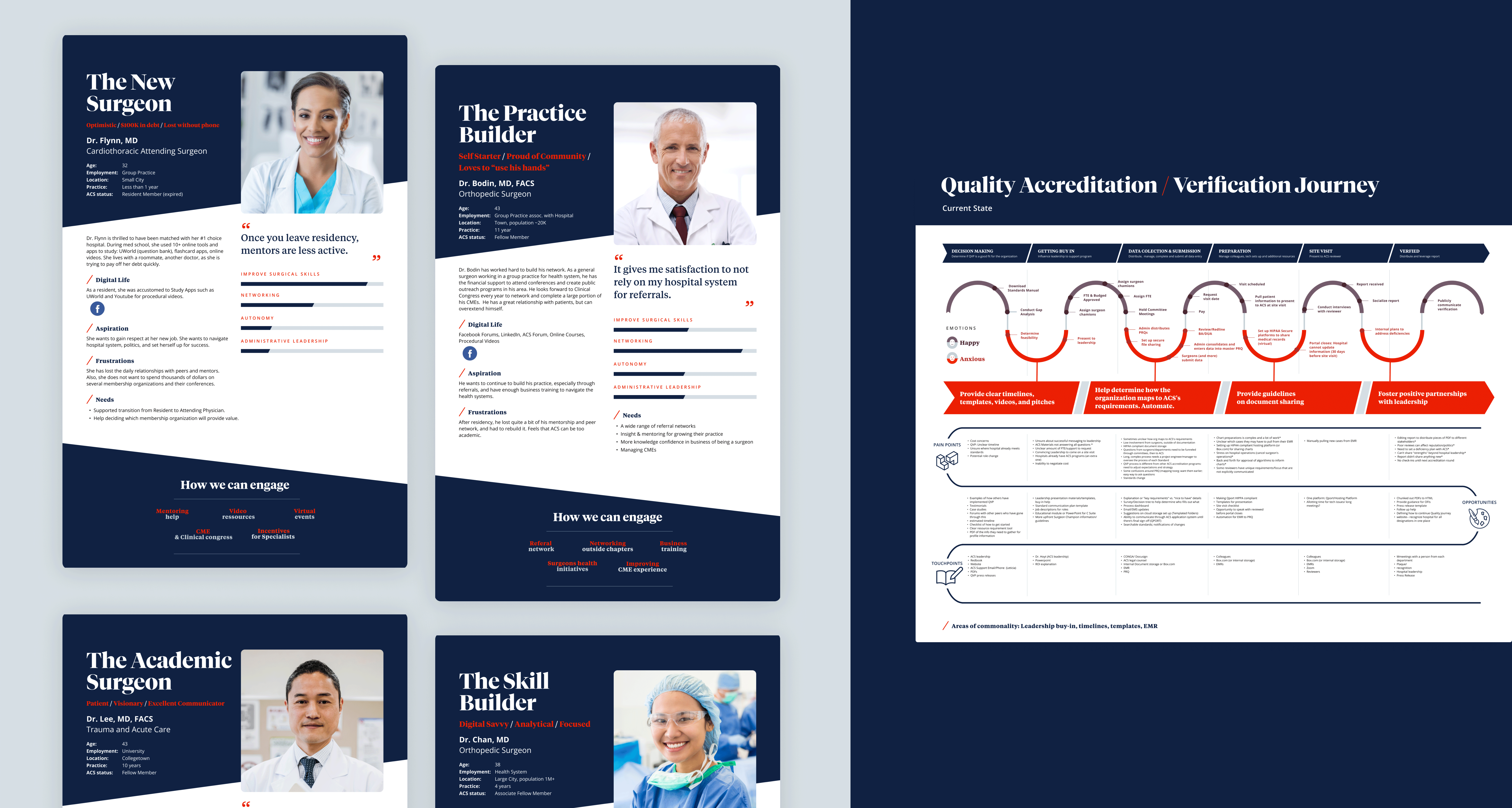
The ACS will enrich surgeons’ lives and practices by guiding their careers, helping them learn more efficiently, and involving them more deeply in surgeon networking and ACS programs.
Within these journeys we can identify key points within the experience that will be critical for users.
We mapped out 17 user task flows from the perspective of our personas. This allows us to create scenarios that support our users needs, such as Well-Being, the desire for procedural videos, education, CMEs, and research. These scenarios and tasks become the basis for our first hypotheses to test around.
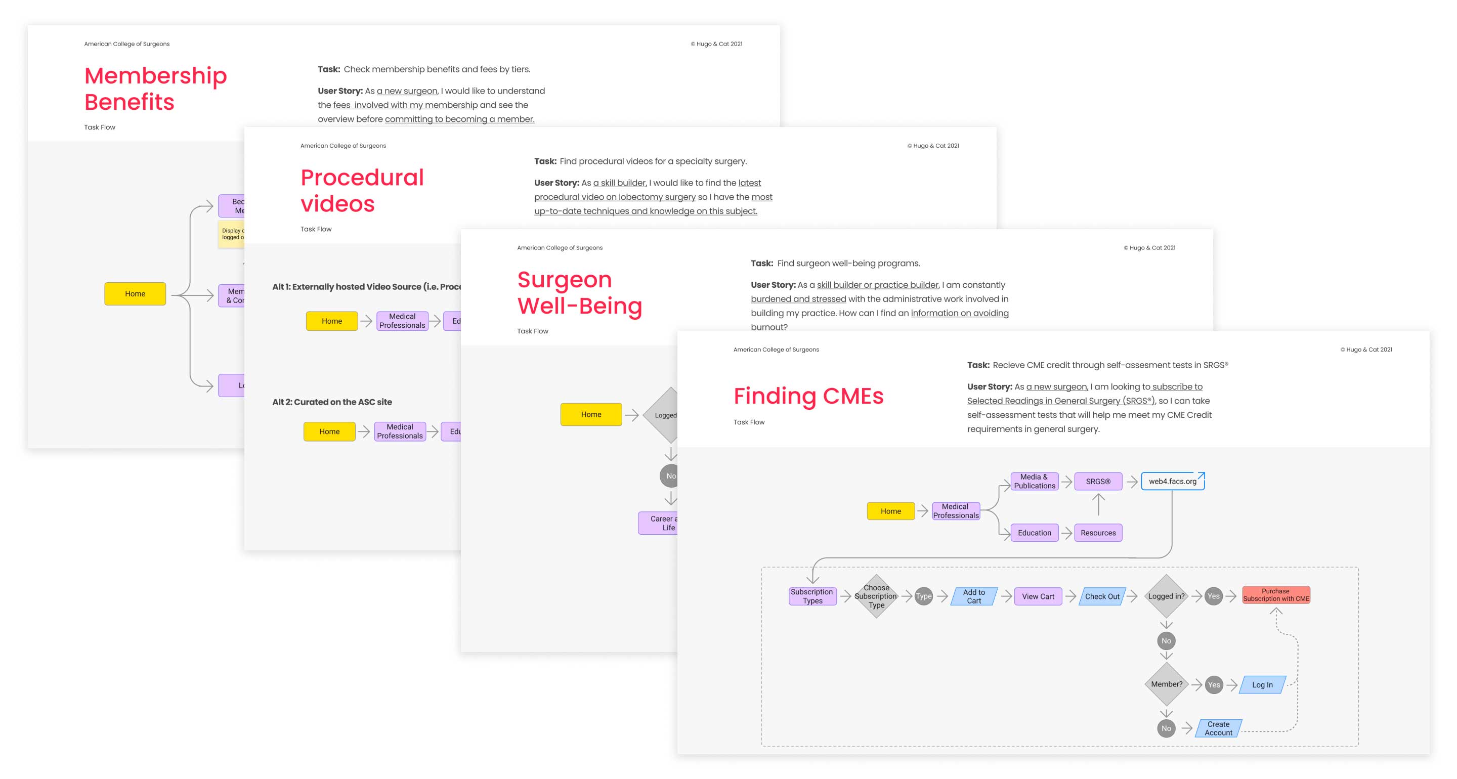
Now, with a firm understanding of our personas, their journeys and the current state, we start forming our hypotheses to test.
Taking a user-informed approach to ideation and iteration allows us to fail fast, learn quickly and continue to evolve our solutions as we progress through the next steps.
At this stage we conducted Card sorting and Tree Testing to best understand our user’s mental models and how they believe the content on the website should be organized and labeled.
To test, we took an A/B approach so that we always have a hypothesis to test against and dig deeper to understand what our users are truly thinking and feeling.
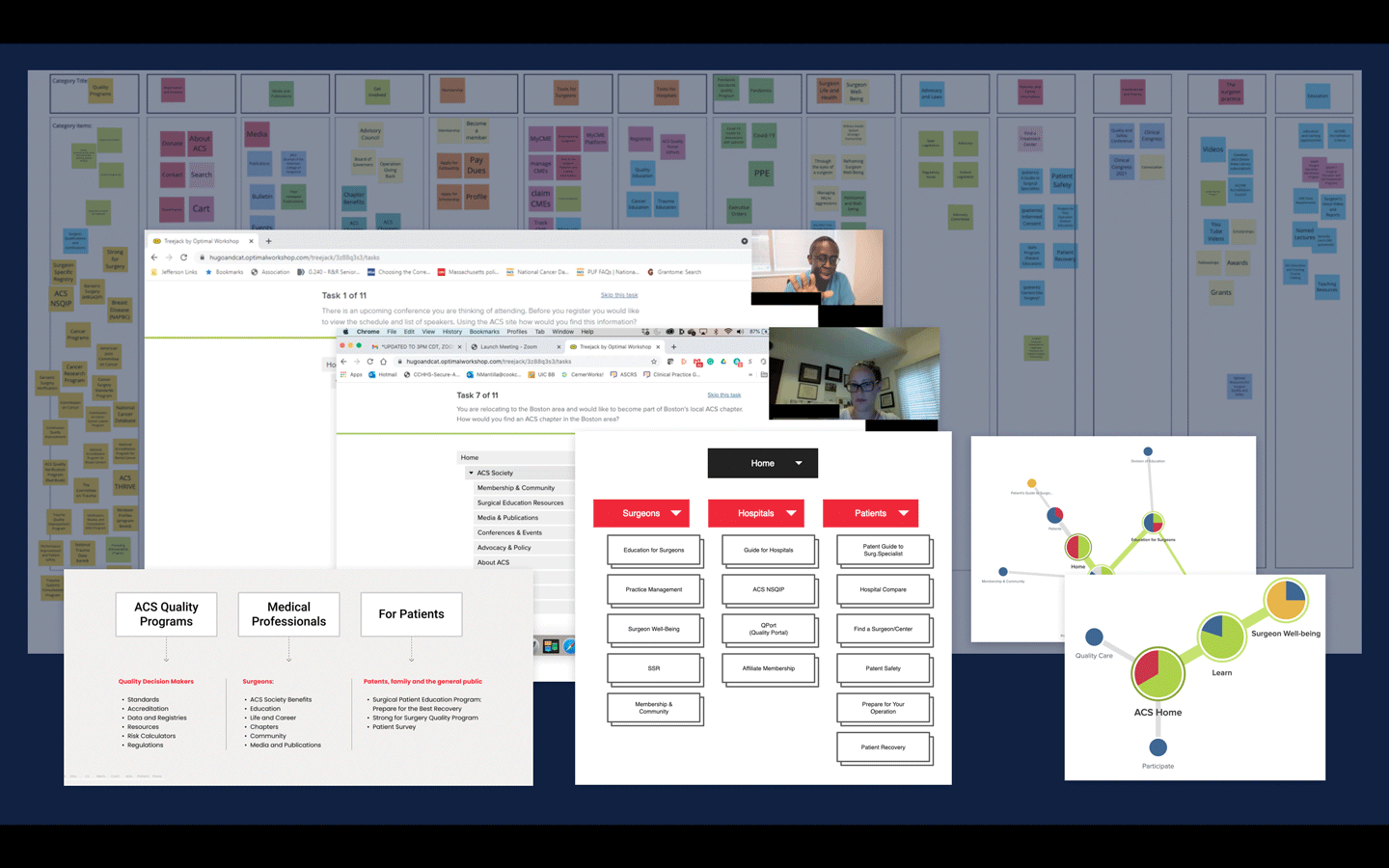
From the card sorting and tree test study, we are able to find patterns in how users expect content to be organized.
We moved to the next stage of defining an expansive site map and finalizing our user flows, then validating each section and aligning with the different ACS divisions.
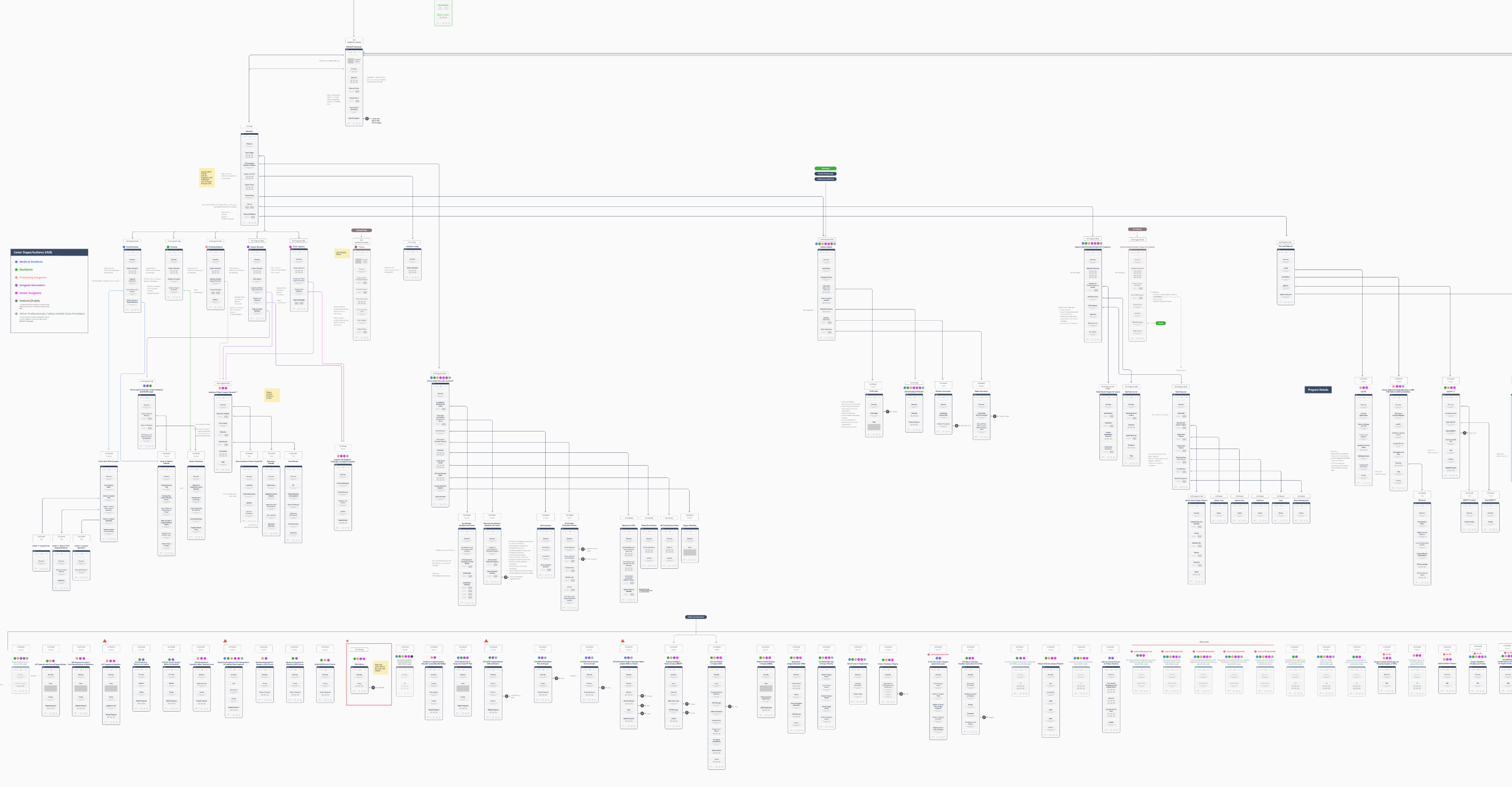
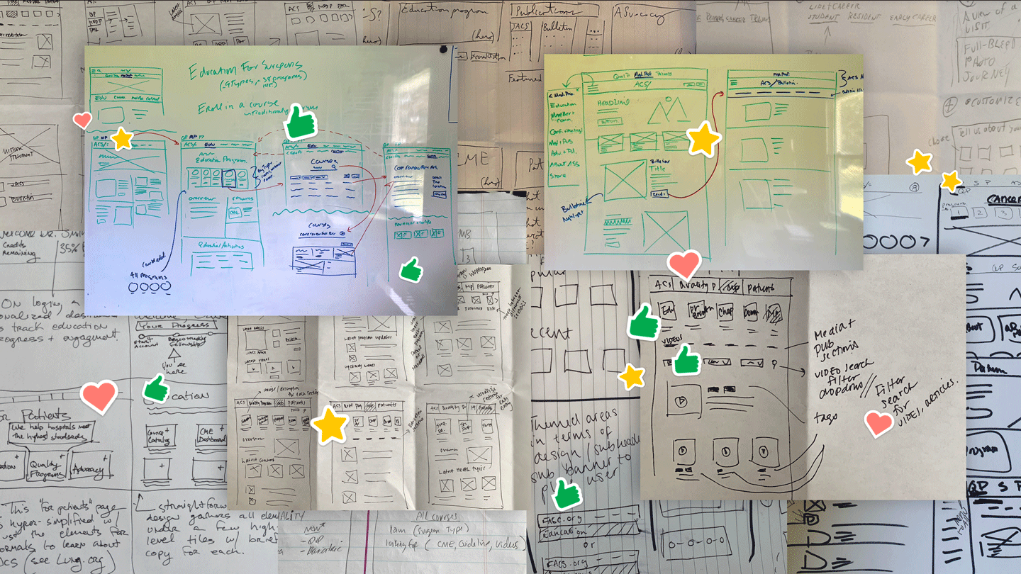
As part of the process, we collaborate as a team together as well as with the client in workshops and brainstorming sessions.
One of these sessions includes Crazy 8’s (or Rapid Ideation) where we try to get out as many ideas as possible. There are no bad ideas at this stage. We then vote and select the best ideas to move forward, refine and take into testing.
Insights gained from observing user behavior during these tests helped prove our hypothesis that organizing content by audience was intuitive. And gave our team and the client confidence that building the website with this structure would be well received by its users.
Two hypotheses are formed again, and we test two clickable low-fidelity prototypes with users. Our users were given prompts with the scenarios that we identified back in the task flows. With this qualitative process, again, we can dig deeper. What are our users thoughts and feelings about the experiences? What are their likes and dislikes? What is it that they would be expecting?
We did this multiple times. Each time increasing in fidelity and formality of the flows and content before finalizing the website’s navigation and page templates.
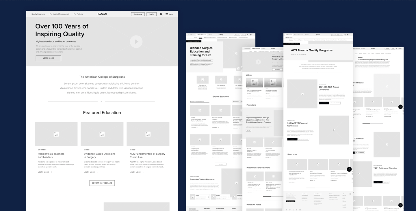
Now the website is really starting to take shape as we move into the visual phase.
To support the strategic shift of the new ACS Brand we brainstormed on how the brand would come to life on the website.
3 different hypotheses were created:
This one showed a little bit more empathy towards patients.
Playing on the seriousness of being a surgeon and showing surgeons in action.
This one was a little bit more edgy and corporate.
We tested all three of these in an unmoderated impression test with 31 participants in the medical field so that we could gather their initial reactions and emotions about what they were seeing.
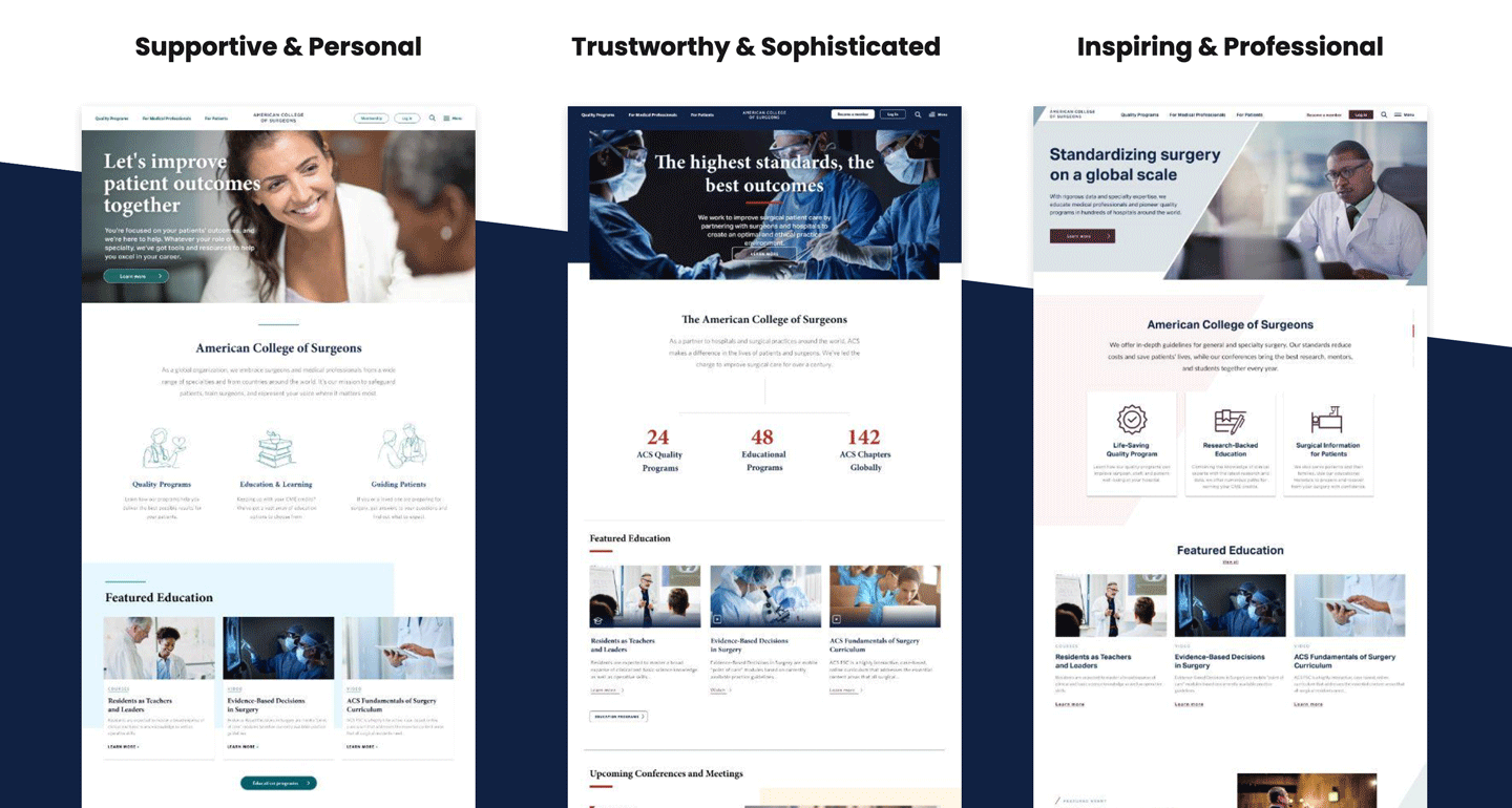
We then took the results from testing and synthesized them to finalize the creative down to two and headed into a moderated qualitative study with 7 Surgeons in 1 on 1 in-depth interviews.
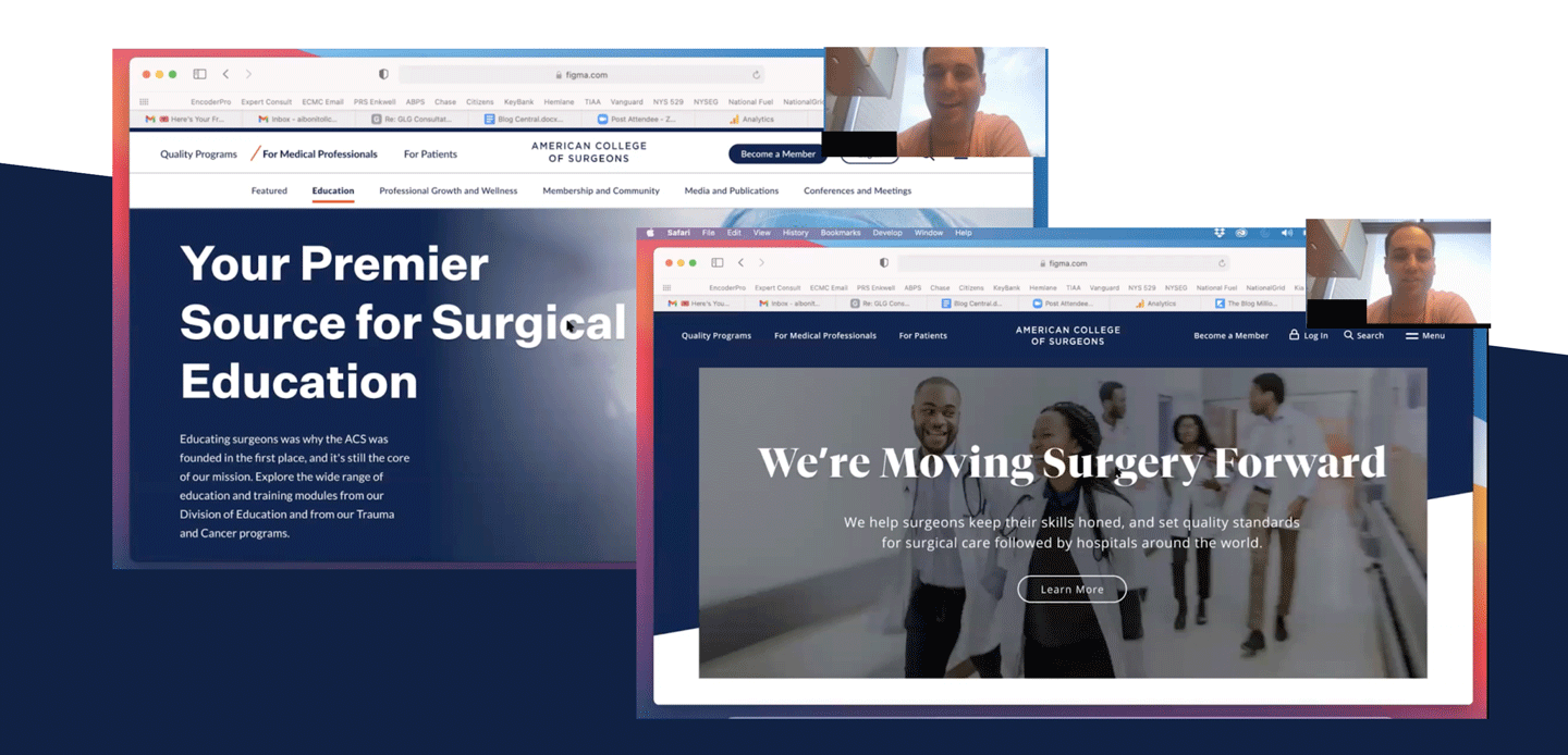
Some of the things we learned in testing was that users and members wanted ACS to appear empathetic, but not too soft. And they really loved seeing ‘Surgeons in action” to convey the serious tone of ACS.
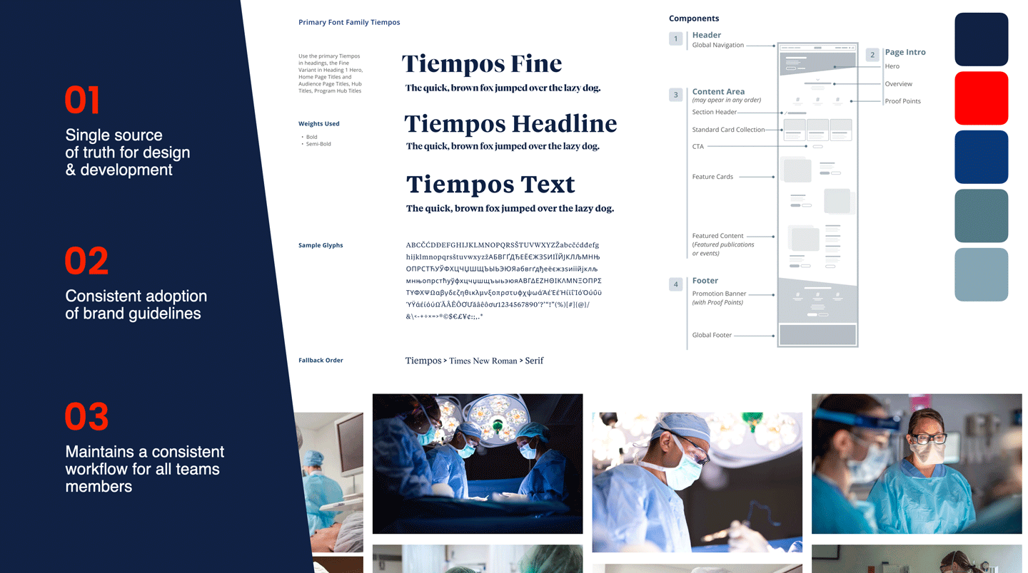
As we worked to finalize the designs based on user data, The ACS design system was also created and acted as a single source of truth between design and development. Specifications around the digital brand guidelines, components and flexible page templates provides consistency across the ecosystem and assist editors with robust guidelines for optimal page creation within the CMS.
The impact of the new site was seen quickly and has only improved since it launched.
Recent metric show:
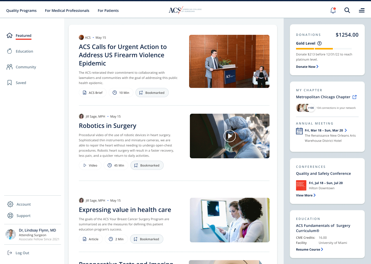
The logged in destination for Surgeons and members that enhances personalized content, courses, and networking.
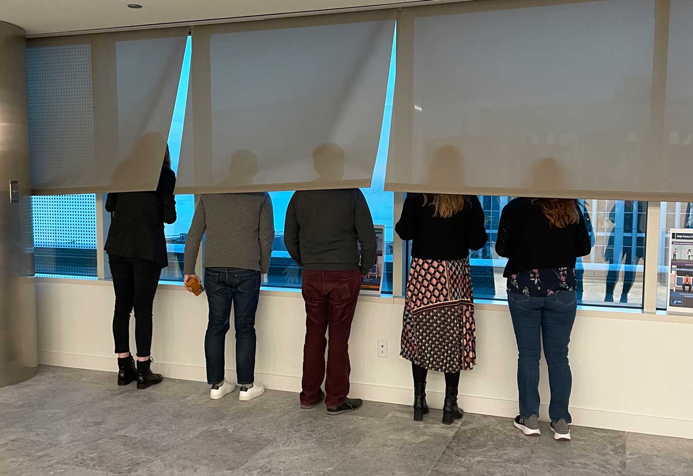
Hugo and Cat traveled to the headquarters of The American College of Surgeons for a 2 day workshop to brainstorm on what was next for the ACS website and the future state of the ATLS.® app.
As tourists in Chicago, we were so excited to see the amazing view of Lake Michigan from The ACS offices that we didn’t take the time to troubleshoot how to work the shades. 😂
ACS Showreel:
Credits:
Client: The American College of Surgeons
Agency: Hugo & Cat
Product Owner: Michi Gupta, ACS
Project Manager: Ailish Ryder
Design Director, Design Lead: Julia Murphy
Designer: Akiko Hattori
Tech Lead: Graeme Mulvaney
Video Animation: Paohan Chen